The opinionated ramblings and muses of a weary web victim.

Recently Zoomba posted he had just reached 5 years with Stardock...and it got me thinking about when I started fiddling with OS Customizing [originally on sites such as Customize.org  and Litestep.com ...and later skinz.org].

The first 'release' of Litestep I came across was called 'b21' or more accurately 1.0 b21 dated 25 March, 1998 ....though the first I actually messed with was b23 a little time after that....but probably just on 10 years ago.

Litestep was thought up by a guy called Francis Gastellu, aka LoneRunnr, from France.

There are snippets in the 'readme.txt' ...you know, the R.T.F.M. that is a MUST for people messing with shells....that are 'interesting' in the Firefly sense...

 What is LiteSTEP ?
   ------------------


     LiteSTEP is a shell replacement for Windows95 (NT not fully supported) that will give
     your Windows the AfterSTEP look&feel.


     It consists in a Wharf toolbar, a popup menu and some modules.

     The Wharf toolbar is used to organize your applications & modules.

     The Popup menu will automatically gives you access to installed applications via its
     start menu.

     The Modules are used to their particular function: Clock, Temperature monitor,
     WinAMP plugin, Virtual Window Manager...


   Your reasons for using LiteSTEP :
   ---------------------------------

     - If you come from the LINUX world and are used to AFTERSTEP.

     - If having multiple desktops would make your work easier.

     - If you dislike Microsoft's Shell or find it eats too much memory, CPU and that it is
       not always stable.

     - If the aspect of your desktop is important to you.

     - If you like to have something different from your friends.

     Or simply to try a cool & stable alternative to Microsoft's Shell.


Origins....

1.0 ß1 - 12/14/97
            - First beta out (private)
            - Lot of bugs
            - Not fully usable

 LiteSTEP is still in beta stage.

      LiteSTEP is freeware. Use it at your own risks! I cannot be held responsible for
      any damage (software or hardware) happened while using LiteSTEP.
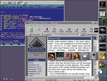
You know, 10 years on and it's STILL in beta .... works a heck of a lot better...does more .... but still in beta.

I am yet to fire up a Vista OS to give it a try...but apparently it still 'works' [or can be made to work], though I have run it in every other MS OS from 95 onwards ....though it did nothing to 'help' Win ME ....that OS was a lost cause....


Comments (Page 2)
2 Pages1 2 
on Dec 02, 2007
Jafo, excellent throw-back. Thanks for the memories.

I, too, have been customizing since the first skinz.org, the first customize.org, the first litestep.net - each of those met their demise at the hands of, well, a change of hands, but they all came back...IMHO never as good as the first.

Then again, I haven't been into litestep (or litestep.net / .com) for a few years now (haven't run it on XP at all) and this took me by surprise: "You can set Litestep up as a seperate user account and boot into it at log on, which is handy." Nice functionality.

If I recall correctly, I used Rainlendar with Litestep before Explorer, too. I used to use WinStep, too, back from pre-v1 to v3x. Remember the "switcher" than lonerunner built? Now THAT was buggy in the beginning, but it worked its way up to a viable option to running "sysedit" and editing the win.ini (shell=explorer.exe) line yourself! Ahhh, those were the days...

(It was the win.ini wasn't it? I can't remember now!)

Anyway, I rather enjoyed messing around with the step.rc file in order to get my desktop to look and feel just the way I wanted it to...but then someone else would come along with a cooler skin or some screenshot of their desktop setup different and I would have to make yet another backup of the step.rc and give the new look a try!

@drop125 - It's safe to say that with the tens of thousands of Litestep users, you were in the minority. Most people that I used to chat with onine were quite fond of the explorer alternative and used it successfully...albeit at different levels. Perhaps you would have been better suited to stick with the basics.   
on Dec 03, 2007
Agreed, Tryzub, poking around in the step.rc file was great fun back in the day, always good to meet others who were around back in the skinz.org days, too You HAVE to remember the 12 Deadly Sins of wallpapering, right? Something like flames, tearing, lens flare, etc. all on one wallpaper and completely despised by Shoggot Wish I'd saved that!
on Dec 03, 2007

You HAVE to remember the 12 Deadly Sins of wallpapering, right? Something like flames, tearing, lens flare, etc. all on one wallpaper and completely despised by Shoggot Wish I'd saved that!

I think I have that somewhere...

on Dec 03, 2007

MODERATION

"A little wine, for thy stomach's sake..."
   --I forgot who said it.

1) What is Moderation?
 At skinz.org, one section is "moderated" - wallpapers. To sum up what this
"moderation" is: it's a culling of submitted wallpapers, separating the best from the rest
and posting the best to the permanent archive.

2) Why Moderation at all?
 When the wallpaper section was first added, there was no moderation. The wallpaper
section grew quickly - and we soon found that the wallpapers, on average, were terrible. We
were getting complaints left and right about the agonies of wading through hundreds of
wallpapers to find one good one. So, as an (at the time) temporary experiment, we started
moderating wallpaper submissions, letting only the best through. The watchword for the
section became "the best of the best" -- we feel that we offer something which you can't
find in wallpaper sections elsewhere, quality over quantity.

3) My wallpaper was Moderated. Does that mean you think it sucks?
 No. It might well be good; it could even be very good. However, remember that what
gets in is what we feel to be "the best of the best" - very good doesn't equal best.
 There is a small possiblity that it did, in fact, suck - which is part of the
reason why we just say "moderated" - we don't want to discourage you from trying again.

4) Why do the rejections just say "Moderated"? I want a full critique.
 If there's something obvious & specific which could be done quickly to make the
wallpaper suitable for acceptance, I'll probably write that in the rejection. The rest
I can't figure out what would be required to make it in. Also, there are about 60+
wallpapers submitted per day - writing a critique for each would require me quitting my
day job. Not to mention, a critique is not always truly desired (even by those who ask for
one!); a critique can be a harsh and cold-blooded thing. I personally value them; I have
people who will look at my work and bluntly tell me what precisely sucks about it. I live
for this; it's what allows me to improve. Some people don't enjoy hearing that their work
sucks, however.

5) Who does the moderation? And why?
 At the moment, primarily me, that is, shoggot. Sort of by default; I think the
others let me do most of the wallpaper moderations to keep the section somewhat consistent.

6) And what makes you think you're qualified to moderate my work?
 The fact that you submitted it to a site which I moderate Seriously though, you
may well be a better artist than I; many, many are. That doesn't mean I won't have an
opinion of your work.
 I've been in the visual arts biz for years; I attended a high school for the arts,
where visual arts was 5 hours a day of the curriculum, from 1PM to 6PM; I went to Minneapolis
College of Art & Design, where I pursued a Fine Arts degree; and have been practicing my
craft ever since. I started with computer graphics in 1984 on a Mac Plus, and have been
involved with computer graphics ever since.
 Does that make me qualified? Dunno. Don't care. I approach every submitted wallpaper
the same way; I ignore who the artist is, what they named the wallpaper, what their comments
on it are, and just look at the piece itself.

7) What about letting the moderation be done by the public?
 We tried this. The response was overwhelmingly negative. People were scared that
their online reputations would make others reject their wallpapers; people were afraid that
comments left on the wallpapers of others would result in retaliation; people were afraid
that the general public wouldn't understand their artwork, and would reject it for not
being lowbrow enough.
 The sad fact is, that with public moderation, the chances of an Insane Clown Posse
wallpaper getting high marks and a misery_in_motion wallpaper getting rejected are all too
real. Do any of the artists want to be put in a situation where the potential viewing of
their work is controlled by Insane Clown Posse fans? I hope not.

8) I still don't think skinz.org should moderate.
 Ok, think of it this way.
 We're a gallery, much like a physical art gallery you might pass on the street.
 If you walk into a physical gallery, is there any guarantee that they will give
you a show (IE, display your work)? No. The gallery director has to look at your work
and decide whether or not he wants to show your work. If he does, great; you're one of the
few. If not, you go home, and try to improve your work. build up your portfolio, and try
again.
 We operate in this exact fashion. We also aren't your only avenue to get your work
shown; just as we are like a physical gallery, there are other galleries which you can
show your work to; some aren't as demanding. In the real world, there are also galleries
where you can pay to have your work shown; in this same fashion, you can get webspace of
your own and display your work there.

9) Ok, so what defines what gets in and what doesn't? What's the criteria?
 I've occassionaly posted very rules of thumb as to what gets in and what doesn't.
 I never like doing this; they come across as hard and fast rules, which they very
specifically are -not- meant to be. All rules can be broken. More on breaking the rules
later.
 Here, begrudgingly, is a rough list of no-no's. There is no list of yes-yes's;
my concept of what's good is too far-ranging to define. There are some things which initially
strike me as bad, however.

 a) Poser. I'm very curious why people think slapping a poser head or body into a
wallpaper can make it good; all it seems to do usually is make the wallpaper look like a
hundred others which have the exact same head or body. We all know the default Poser male
and female models by heart now; move on. There are photos in free-use archives aplenty if
you aren't good at figure drawing. If for some reason you need a metallic figure, try grey-
scaling & then solarizing a regualr human in a photo.

  Bryce. Yes, it's a full-bore 3d app; but only kinda. It comes with presets and
wizards to allow you to make a quickie landscape in no time flat. If it had the ability
to accept commandline input, I could write a .bat file to make random landscapes at the rate
of one every five minutes. Just because it's photorealistic, it isn't necessarily good art.

 c) Chromed 3D primitives. Again, I can crank out (you can too, play with Bryce for
5 minutes and you'll understand) a new wallpaper every five minutes which features a photo-
realistic landscape with a floating or buried chromed 3D primitive. It gets boring very
quickly.

 d) Large text. My thinking is, if you need to spell out for the viewer what they
should be thinking when they look at your wallpaper, you're doing something wrong. This is
a no-no which I frequently allow to be violated, but I think in most cases where I allow
big text, the text is -not- the central focus of the piece.

 e) Binary. Yes, we get it, it's computer graphics. Try to resist the urge to fill
your background with one's and zero's. It's been done, the horse is dead already.

 f) Asian text. Yes, we get it already. This falls under the combined aegis of Large
Text and Binary; resist the urge, if the only way you could come up with to make your
wallpaper look cool was to add a huge kanji character in the middle, you're doing something
wrong.
 g) Difference Clouds. Yes, it produces a neat-o smoke effect. It can be used to great
effect in textures. Used as the primary focus, it stinks. Use it as a tool, not as art in
and of itself. The computer did that, not you, don't try to take the credit.

 h) Swirlies. I've never understood why some people think applying a swirl filter to
any image makes it look cooler; it just makes it look like a slurpee viewed from above.

 i) Lightning. It's -incredibly- hard to produce realistic lightning. I've yet to see
it done well.

 j) Lighting Effects / Emboss / Crackle. Adding these to an image probably won't help
you. If the image was interesting before the effect, submit it. If it took the effect to make
it interesting, it probably -isn't- interesting.

 k) "Filter Frenzies". This describes you, late at night, starting with a blank canvas
(or maybe you've added a few simple brush strokes), and applying filter after filter after
filter, until more or less totally by chance, you arrive at something which you think looks
cool. Chances are you're wrong; it'll just look like a mish-mash of filters. A good thing
to practice is to have an image in mind -before- you approach the canvas, and then attempt to
make that image appear on the canvas. It's harder, yes, but it'll help you develop as an
artist.

 l) Signatures & URL's. It's your work, yes. You want to advertise your website, I
can understand that. Just please, please, don't put the sig & url in a 36pt font w/ a high
contrast color; would you want to look at my name & URL every time you looked at your
desktop? Didn't think so. And -don't assume that since it's on the bottom, it'll be covered
by the taskbar; very many users of this site don't -have- taskbars.
 My suggestions: g'head & sign & url 'em, 12pt font or less, & put the sig & url on
a new layer & drop its opacity to about 30% or less. It'll still be readable, but it won't
overpower the piece. If your concern is only for copyright protection, try watermarking;
no noticeable degradation of image, nothing visible, but it holds up in court a lot better
than a simple sig on the bottom which can be altered oh-so-easily.

 m) Copyrighted & Trademarked images. Ok, this one's a guarantee; use 'em & it won't
get in.

 n) Anime, Comic-Book art. Falls under the copyright / trademark aegis.

 o) Spacescapes. Falls under the Bryce landscape aegis.

 These rules can be, and are, violated often. If you do something really novel which
happens to include some of the no-no's, it might get in. These are only guidelines.
 It doesn't mean that you're guaranteed to get in if you -aren't- violating any of
the no-no's.

10) You haven't accepted any of my work, I think you have a bias against me.
 Unless your name is Anna Brogan, wrong. I've judged your work on a piece-by-piece
basis, just like anyone else's.

11) You accepted two of my pieces, then rejected the next five. What's up with that?
 I liked your first two a lot, the rest not-so-much. It isn't personal. Try again.

12) Any parting comments?
 No. If I come up with more, I'll add it. Go create something. Impress me!

*******************

This was saved to my drive in April, 2000 ...originally penned by Shoggot -  the 'wallpaper moderator' from skinz.org. ...


on Dec 03, 2007
Insane Clown Posse
DETROIT RULEZ!!!


WOOOOOO!!!!!!

   Sorry.  Couldn't help myself.  


Thanks for digging this up Jafo.   
on Dec 04, 2007
h) Swirlies. I've never understood why some people think applying a swirl filter to
any image makes it look cooler; it just makes it look like a slurpee viewed from above.


BAHAHAHA...thanks Jafo, that STILL makes me laugh. Somebody did submit a wallpaper with ALL of those in there and it got through, hilarity ensued
on Dec 04, 2007
Thanks for posting the ol' rulez...that was great. I've got so many old hard drives sitting around that I'm sure I've got some posts from Custo or Skinz. One day I plan to converge all of my archived data onto one multi-terrabyte disk...

yeah right
on Dec 04, 2007

Thanks for posting the ol' rulez...that was great. I've got so many old hard drives sitting around that I'm sure I've got some posts from Custo or Skinz. One day I plan to converge all of my archived data onto one multi-terrabyte disk...

yeah right

Yes, much the same here....

Ah....to have an organized mind....

2 Pages1 2